Sip
Newcomer

Posts: 6
|
Post by Sip on Dec 17, 2010 2:11:03 GMT 8
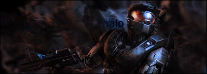 whatcha think? |
|
|
|
Post by wrcr87 on Dec 17, 2010 8:35:08 GMT 8
Hmm, pretty decent, but I think the text could stand out more? Right now its quite hard to read. I think your render can be given abit more depth so that it stands out also. Your background is nice though.
|
|
|
|
Post by Xclamation! on Dec 17, 2010 12:55:22 GMT 8
Ooh Ooh! Nice!! I was never a fan of Halo, but this is really nice. And yeah i agree, the text is a little too blended, hard to see. But otherwise, NICE ONE! Can i rate it?   |
|
|
|
Post by PHYsics on Dec 17, 2010 13:37:00 GMT 8
The weak point is definitely the text. It's too dark, I only really noticed it when I saw wrcr87's comment.
Other than that, its a pretty good signature.
|
|
Sip
Newcomer
Posts: 6
|
Post by Sip on Jan 4, 2011 9:44:26 GMT 8
Thanks for the input guys.  |
|