|
|
Post by wrcr87 on Dec 14, 2010 19:34:33 GMT 8
Was playing around with certain features on PS for about an hour, and got this: 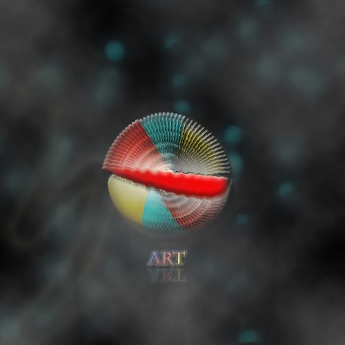 C&C welcomed  |
|
|
|
Post by Silver Aislin. on Dec 17, 2010 11:32:33 GMT 8
So. I like this. However - I think there's a bit too much background where the image is quite.. small? This is merely a personal opinion, though. I also think that the main circle could be blended a tad more into it, but hey - It gets the point across. |
|
|
|
Post by Xclamation! on Dec 17, 2010 12:58:28 GMT 8
Yea. I agree. Its really cool and awesome but, its really too small compared with the full size of the image. The word is also a little, uhm, blur? Maybe it was meant to be but, yeah. Like your previous work, i also dont get how the word 'Art' fits in  But otherwise, really nice work! |
|
|
|
Post by wrcr87 on Dec 17, 2010 14:28:15 GMT 8
Thanks guys! I suppose I could downsize the background abit, but I was trying to give the focal point more "breathing space", and to add more depth. Text wise, it is meant to be more abstract, thus rather blurry. And "Art" refers to the piece as a whole? Thanks for your comments anyway |
|


